Easily scanned web pages mean your content gets read, and your visitors return.
Few of your website’s visitors will read every word on a page, and most will decide in just a few seconds whether to read on or click away. So however great your content, if it isn’t arranged it in a way that can be quickly scanned, it won’t even be seen.
1. The F-shape
Web pages are typically scanned from the top left corner, across to the right, and then top to bottom along the left side of the page, in an f-shape. So get the important words into the headline and first sentence, and at the beginning of paragraphs where they’ll be seen.
2. Headline
Always have a headline, and keep it meaningful and direct. Remember the f-shape – use the important words towards the beginning. Your headlines might appear in many other places as a link to the page, so make sure they describe it well.
3. Standfirst
The first 1 or 2 sentences that many pages have below the headline, emphasised in bold or a larger font size, is known as a standfirst. But don’t just bold the first sentence – a well written standfirst will succinctly describe the whole story and act as a teaser to tempt the reader on.
4. Short paragraphs
Short paragraphs are easier to scan and a lot less off-putting than a page of dense text. Paragraphs should have just one idea and be a maximum of 4 sentences, though will often have just 1 or 2.
5. Subheads / cross heads
Use crossheads to break up pages, perhaps two or three for longer pages. Keep them short and meaningful, describing the text to come. And remember the f-shape: always left-align your crossheads.
6. Lists
Lists can be great for displaying easily scanned ideas. But don’t overuse them and keep the items short. Just putting a bullet at the beginning of your paragraphs doesn’t make it a useful list.
7. Links
Format your links to stand out from the rest of the text. So make sure they’re highlighting words that help visitors understand the content of the page, never use ‘click here’, ‘read more’ or ‘this ‘report’.
8. Pullquotes
A pullquote is a very short (and interesting!) quote displayed in a large font. The quote will often appear elsewhere in the main text. If so, make sure the pullquote is some paragraphs above so it encourages the user to keep reading.
9. Images
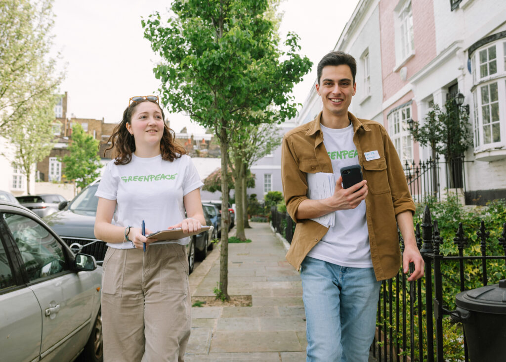
Images can work well for breaking up text. But use with caution as studies show that text is better for scanning than images. And make sure your pictures are extremely clear, graphically strong and simply convey a single idea.
10. Captions
Images should always have captions, and should add new information and help the understanding of the page – a simple description of the picture doesn’t make a good caption
Reading and resources

